Published Version of this blogpost on Jenkintown Running Company‘s The Running Board blog
4/28/2019

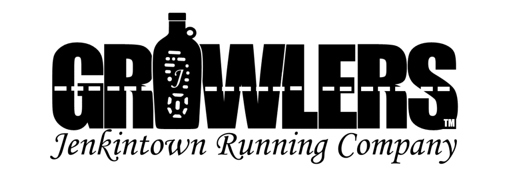
Behold the logo! The origin of our new logo is shrouded in peer pressure. (“If your friends jumped off a cliff would you follow?!” “Yes, ‘cuz I wouldn’t have any more friends?”) As the native club for Jenkintown Running Company, we’ve been in existence nearly since the founding of the store in 1981. In recent years, Drew (marketing manager) invited Pennypack Trail Runners and Elkins Park Beer Runners to partner with the store. EP brought their logo printed on an embarrassingly large sign that they featured in every group-run picture…looking, actually, pretty cool. And then shirts started going on sale. With their logo printed on them, natch. The pressure to come up with our own was on. But when PTR got their own shirts the gauntlet had absolutely been thrown down and Drew started tightening the thumbscrews on the members of the Growlers.
The group name itself was a given when Fast Dave first coined it for one of the 2 store’s Broad Street Run teams in 2017. Its double meaning captured the essence of the drinking group with a running problem perfectly. You the man, FD!

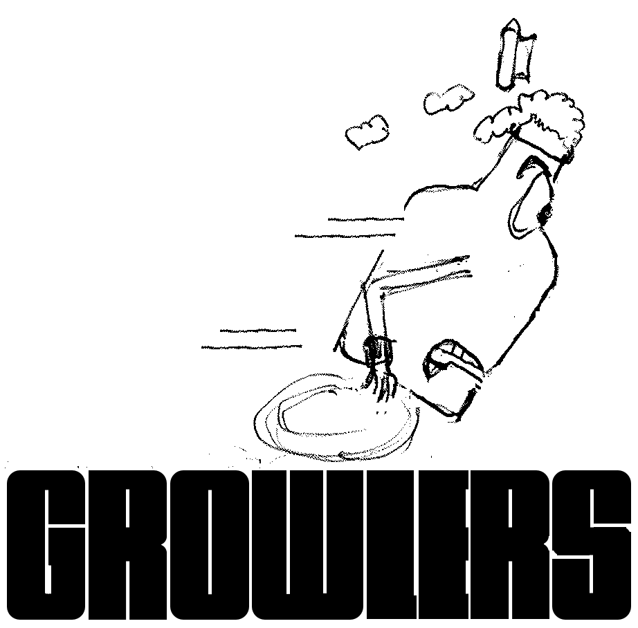
I toyed with the idea of a cartoon character first. (I’ve always liked Berke Breathed’s Bloom County cartoon eyes. Additional aside: Though an academic librarian now, I also have previous training in visual art—medical illustration, specifically.) The idea of the letters as pavement were there from the start. I designed my own typeface with a density that emphasized blackness. The character still has some potential, but it felt like we need something a little more elemental. The growler still needed to be there somehow and the idea of it becoming part of the name itself materialized. Don’t laugh (Kate did, at least to herself) but I use PowerPoint a lot for graphic work. Librarians don’t have much call for Adobe Illustrator, so I don’t have it installed on my computer. And you can do amazing things with its curve-drawing function once I figured out how to tweak individual points and their splines. A few clicks for the profile, a vertical flip for the other side, a couple of extra shapes, and voila! A growler for an “o.” With input from Drew, Keith (the store manager), and Kate (an interior designer), I jazzed it up with a shoeprint featuring the Monotype Corsiva J from the store’s logo. (Okay, I actually ignored their suggestion to ditch the J. I’ll take the hit if you agree. I’m a big man. Figuratively.) The dashed lines cemented the pavement imagery and the Jenkintown Running Store logo, the organizational parentage. The one recommendation I did accept from the peanut gallery was to find a more open, readable typeface. Enter Impact which took the place of mine perfectly and I have no misgivings whatsoever. None. At all. Really. >snork< The TM gives our new logo authority. It’s legit even though it’s not registered. That would be a Ⓡ. (I teach a course on intellectual property.) Finally, with store owner Joe’s blessing the logo became a thing! And we’ve now jumped off the cliff too. Safe even, cushioned by the bodies of those who leapt before us. Let’s make a million selling merch!
-CtCloser (Calvinthe), “Negative split or positive splat”
Text and graphics: Calvin Wang, CC BY-NC-SA 4.0
2022’06’02’R